Back to basics: Common mistakes in logo design
A strong logo is essential for a business to make a good first impression on its audience. However, it is easy for a logo to be poorly thought out and ineffective.
Creating a good logo requires a lot of work, but it pays off by helping to craft a solid brand identity.
These are some of the most common errors when designing a logo — and how to fix them.
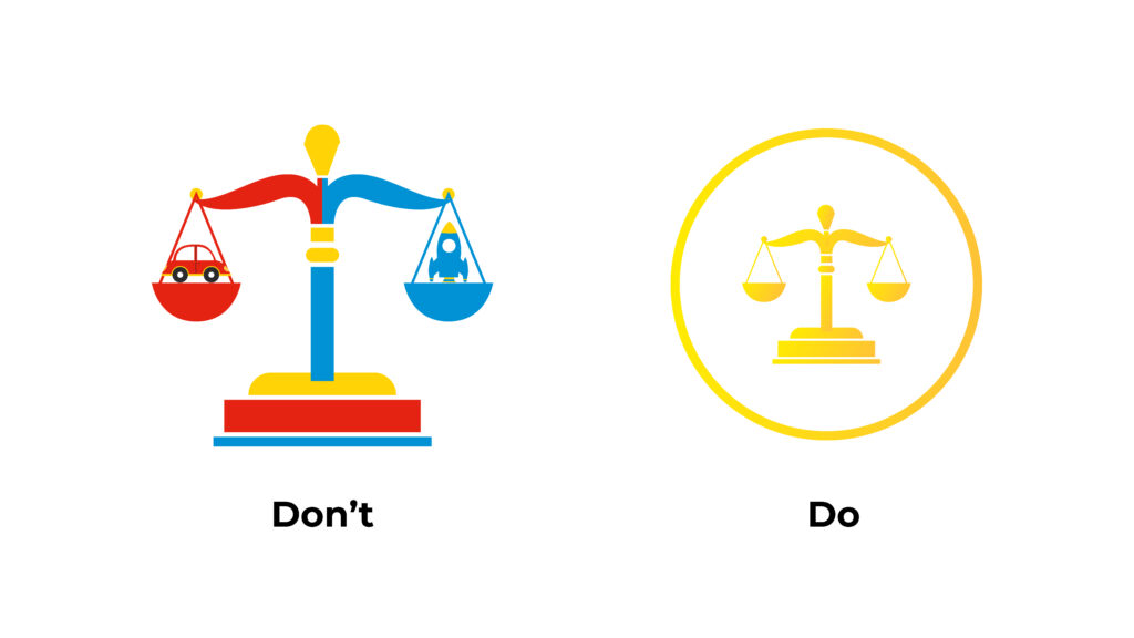
Too many colours
Too much of something is never a good thing. This common phrase is especially true for colours in logos.
It is best to keep the colours to a minimum avoid a logo looking messy. Overusing colours also makes the logo’s message unclear, making it hard for an audience to resonate with it.
Inconsistent colour values
If a logo has multiple colours, keep in mind the values and saturation used. These terms refer to how strong and bright a colour is.
Placing two colours of different saturations next to each other can be jarring. Ensure that the colours used are of similar saturations and values.
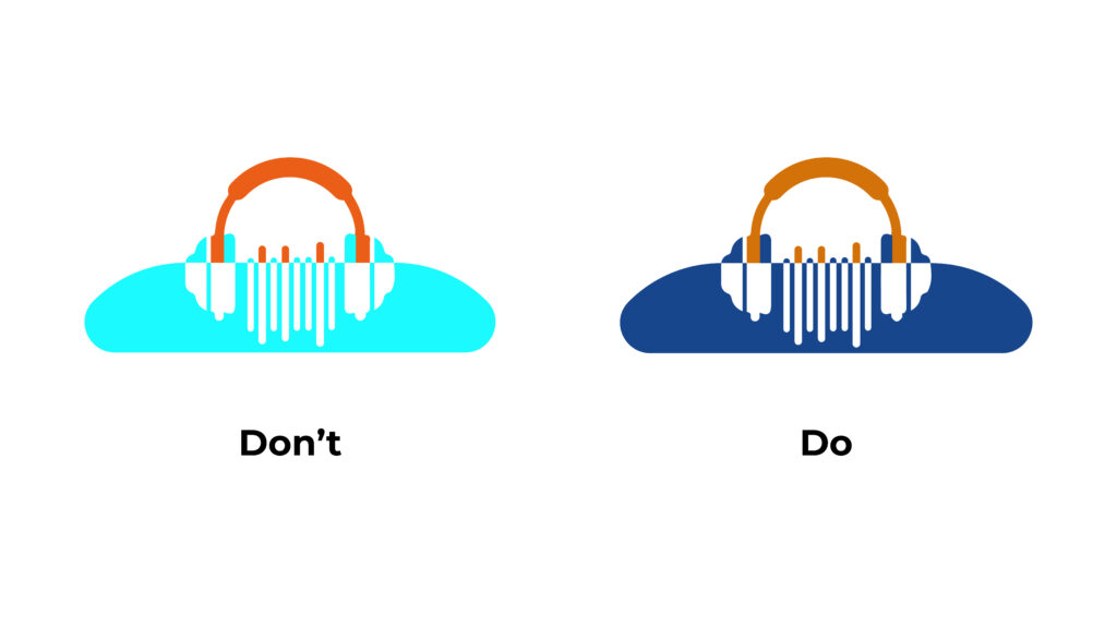
Notice how the colours in each row all look good beside each other. However, when mixing colours from different rows, they tend to clash.
A logo with similar colour values creates a sense of unity in the design, making it easier for the viewer to look at.
Designing in colour first, rather than grayscale
A logo design should be effective on its own without colour. The shape should be recognizable even when the design is in black and white, also known as grayscale.
When designing a logo, try it without colour first to see if the message gets across.
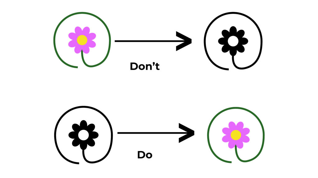
In the first set of logos, the design looks visually pleasing in colour. However, in black and white, the silhouette is hard to read. This can easily be fixed by starting with a strong grayscale design before adding colour, as seen in the second set of logos.
Overly complex design
Again, having too much going on is generally not a good idea when designing a logo, which also applies to using shapes.
With too much going on, the design gets chaotic, and he main message can get lost. It can also signal a sense of uncertainty to the audience. It tells the viewer that a brand is unsure of its core identity and cannot present a simple image to represent itself.
A complex design also makes transferring a logo across a wide range of media more difficult, limiting where the logo can be used.
An overly cluttered logo can also become an accessibility issue. If individuals with visual or cognitive disabilities have difficulty deciphering a logo, a company risks alienating some of its target audience.
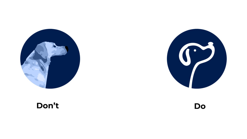
Miniscule detail
Similar to the previous point, only incorporate a few elaborate details into your design. Simplicity is often the way to go, especially for beginner designers, as it presents a clean, confident look.
Always prioritize legibility over detail when designing a logo. It helps to think about what the main image the logo represents while ensuring viewers can read it easily.
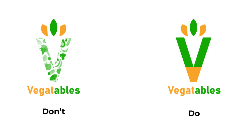
With so many details, it becomes hard to recognize what the logo represents. Focusing on the message over detail allows viewers to read the logo more easily.
Forgetting the audience
Always make sure that the elements used in the logo will resonate with the target audience. This will require adequate research to ensure the design is appropriate for the brand. For example, a law firm may want to avoid brighter colours for a more sophisticated look, while a children’s toy company may benefit from incorporating more bubbly, fun imagery in its logo design.
Take the law firm example. The logo on the left is not necessarily bad, but it does not suit the image of a law firm. The one on the right is more professional and straightforward, which is the brand message the organization wants to send out to their target audience.
Designing a logo requires more work than some may think, but it can be rewarding. Producing a solid logo is essential in developing a brand identity and making a company more memorable for its target audience.

Kyle Quilatan
Kyle is a reporter for Business Hub. He enjoys art, music and reading, and is prepared to take a nap at any given time.