Finding your type: Choosing the right font for your business
Different fonts can lend different feelings to the businesses that use them. Whether on a website, a poster or any other media, your chosen font is essential to building your business’s identity. Fonts can help communicate your brand’s value and create a connection with your target audience.
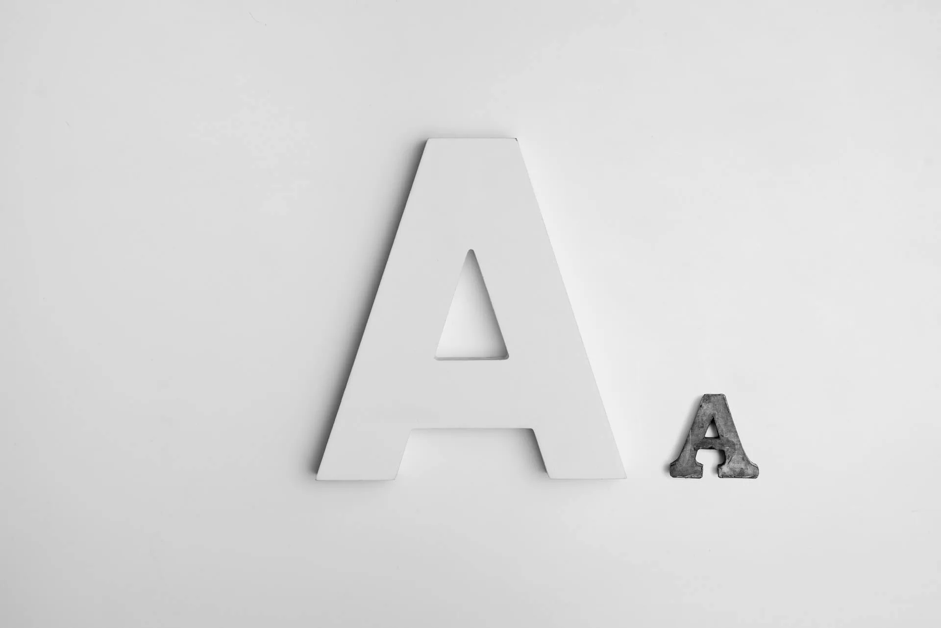
Keep reading to learn more about the different types of fonts available.
Serif
Serif fonts have extra strokes on the ends of their letterforms called serifs. One theory suggests that serifs originated from extra marks on letters left from brushes or quills after finishing each stroke.
These fonts are typically considered more traditional and lend a more professional, authoritative feel to your work. Older, reputable institutions like the New York Times still use serif fonts, suggesting an experience that comes with age.
These fonts also have some functional value. At smaller font sizes, serifs can help to make letters more distinguishable, making words easier to read. This makes text more accessible to those with sight-based or cognitive issues.
Some serif fonts include Times New Roman, Georgia and Garamond.
Slab serif
Slab serif fonts are thick and blocky serif fonts. They are bold and attention-grabbing and are often used in logos or headlines. They stand out and are ideal for making a portion of text more distinguishable from others. Brands like Honda use slab serif fonts paired with bold colours in their logos for an eye-catching result.
Due to their blocky appearance, slab serifs can sometimes have less contrast between letters. While words can quickly grab attention, individual letters may get lost in smaller sizes. They can also be overwhelming when used in larger blocks of text, so they are typically reserved for titles, headlines or anything else that needs to draw a viewer in quickly.
Some slab serif fonts include Rockwell, Clarendon and Roboto Slab.
Sans serif
Sans serif fonts do not have serifs on the end of their letterforms. They have a more modern look than serif fonts and are often used for their high legibility and clean appearance. Sans serif fonts have similarities to today’s writing, as pencils and pens do not produce the serifs that older quills and brushes did, lending to the modern feel of these fonts. Companies like Google use sans serif fonts to establish a cutting-edge brand identity.
Sans serif fonts are ideal for portions of text that are meant to be read quickly, so they are often not used in longer blocks of text. They are also great for signage since they can be read easily from a distance. The Accessibility for Ontarians with Disabilities Act (AODA) recommends using sans serif fonts for signage to make letters readily distinguishable and easier to read.
Some sans serif fonts include Futura, Helvetica and Public Sans.
Script
Simply put, script fonts mimic traditional cursive handwriting. They include varying line weight – the thickness of each line – to emulate pressure sensitivity seen in handwriting. Script fonts often give off a sense of creativity or elegance instead of strict professionalism. Companies like Instagram use script fonts to articulate a unique brand identity.
While visually pleasing, script fonts can be hard to read because of their elaborate nature. They are best suited for titles or headlines instead of longer blocks of text. The Instagram homepage only uses a script font for the logo, while the rest of the text is in a sans serif font.
Even when used in titles, script fonts should be used carefully. Since they emulate cursive writing, script fonts involve connected letters. Individual words can already look crowded if the spacing is not correct.
Some script fonts include Pacifico, Alex Brush and Lobster.
At a glance, fonts can say a lot about the brand that uses them. They can change how a website, logo or any other media is perceived, so they must be chosen carefully. The four classifications of fonts outlined here have several subcategories to explore, so there is a lot of material to work with.
Experiment with using and combining different fonts to see which works best for the project at hand. Remember, this simple choice of font can help amplify your brand’s message and identity, so research and plan out your font choices thoroughly.

Kyle Quilatan
Kyle is a reporter for Business Hub. He enjoys art, music and reading, and is prepared to take a nap at any given time.