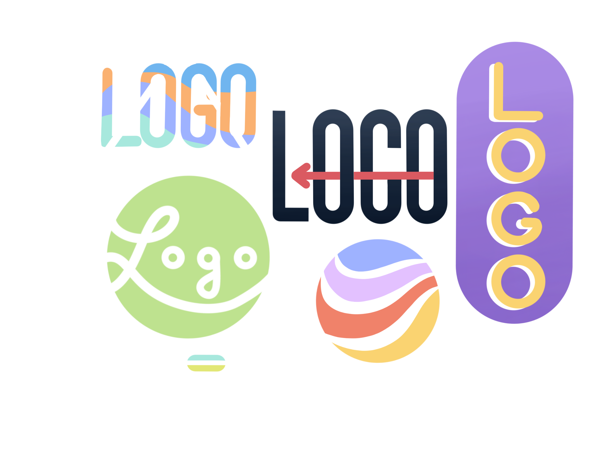
Logo design 101
When creating a business identity, it’s important to consider how recognizable a brand will be. Much of this has to do with having a memorable logo. Colours play a big part in achieving that. Brands become attached to their logos, making it impossible to imagine one without the other. More importantly, it becomes difficult to forget the colours associated with both.
What is colour psychology?
Simply put, colour psychology is the study of how colours affect people’s perceptions and behaviours. Different colours are often associated with different emotions. Consider these common associations: red is an angry colour and blue is a sad colour.
Colours can also have associations that go beyond emotions. For example, green is often thought of as a colour of nature and healing.
While there are many common ideas of how people perceive colour, colour psychology remains a highly controversial field. Perceptions of colour are dependent on a variety of factors. And not everyone will have the same associations with every single colour.
A study shows that men tend to prefer bolder colours, while women tend to prefer softer colours. But this study leaves out several variables. It only includes participants from Western societies, so it doesn’t include many cultural or religious variations. The study is also unable to consider personal associations. Much of the perception of colour comes down to personal experience and preference.
Colour psychology and marketing
A brand needs to have a strong presence to attract customers. This includes having a memorable logo.
Colour choice is often a big part of logo design as companies try to use common colour associations to build their identity. For example, the iconic golden arches at McDonald’s are yellow, which is considered an optimistic colour. It tends to give off a cheerful aura and is easy to spot from a distance. That makes it perfect for attracting customers on a busy road.
However, as mentioned before, colour associations are not always universal. While one person may see yellow as a happy colour, another may see it as a sign of caution.
How can colour still be an effective marketing tool if its resulting perceptions are inconsistent? To answer this, it’s important to have a slight change of mindset. Don’t think too much about what the colours mean to every single customer. Don’t attempt to cater to the colour associations of individuals as that is next to impossible.
Instead, think about what the colour means to your business’ identity. Do your business’ colours match what the business has to offer? Think about what the colours mean to your brand and then consider how this might connect with customers.
There are no clear-cut guidelines for how to do this. It might come down to trial and error. But it’s important to be able to find colours that match your business’ identity.
A study shows that people prefer easily recognizable brands. Part of this means having a relevant set of colours included in your brand’s personality.
Designing a logo for your business
In her paper about brand identity, psychologist Jennifer Aaker presents five core dimensions that most business personalities fall into. These include sincerity, excitement, competence, sophistication and ruggedness. Some businesses have an overlap between two of these traits, but most fall into just one.
When creating a brand identity, think of what personality you want your business to have. Then, use colours in your logo to support that personality.
Again, there’s no single formula for achieving this and choosing the perfect colours. But common colour associations can be somewhat helpful.
They are not meant to be the entire basis of your colour selection. But knowing some associations can help build a personality when considering different colour combinations. Note that the following list applies mostly to Western cultures and may not be applicable worldwide.
- Red: Evokes excitement and passion, sometimes considered the “strongest” colour. Examples include Nintendo and Puma.
- Orange: Considered a friendly colour. Examples include Fanta and Reese’s.
- Yellow: Considered an optimistic, eye-catching colour. Examples include McDonald’s and Denny’s.
- Green: Relates to health, nature and serenity. The easiest colour for the eyes to digest. Examples include Xbox and Whole Foods.
- Blue: Signals dependability and security and is the most popular logo colour. Examples include Walmart and Oral-B.
- Purple: Symbolizes creativity and imaginativeness. Examples include Hallmark and Cadbury.
Notice how some logos borrow from multiple colour categories. For example, while the Walmart logo is predominantly blue, it also features eye-catching yellow. The company is able to benefit from both colour associations. While also having a large colour contrast to make the logo more memorable.
Some companies also benefit from breaking conventions in colour associations. As a gaming company, Xbox often inspires excitement and action. But they still choose to use a calm green in its logo.
There is no definitive answer on which colours work best for which brands. Regardless, it’s important to carefully consider which colours to use for a business’ identity to connect with its customers. It becomes much easier to market to the public when you have a logo that sticks with people.

Kyle Quilatan
Kyle is a reporter for Business Hub. He enjoys art, music and reading, and is prepared to take a nap at any given time.